How to build, test and validate a method you can measure. Twelve chapters covering the main families of approaches — without selling any of them, and saying each time which market regime they work in and which one they fail in.
0/12
01 What a strategy really is
Before looking at any of them, let's set out what a strategy has to contain to deserve the name. Much of what circulates under that label is only an entry signal — and an entry signal is no more a strategy than a key is a car.
A complete strategy answers five questions, in this order. If one of them is missing, you will be able neither to apply it consistently nor to measure whether it works — and a method you cannot measure never improves.
1When to trade. In which market regime, at which hours, on which instrument. A method that does not state its ground will be applied everywhere, and therefore badly.
2When to enter. The exact conditions, all of them mandatory. There is no such thing as an "almost valid" entry.
3Where to place the stop. At the point where your scenario becomes wrong. Not at a distance that makes the reward-to-risk ratio look good.
4Where to exit in profit. On which level, or by which trailing rule. Decided before you enter, never while you are in.
5How much to commit. The size worked out from the risk accepted and the stop distance.
The complete-strategy test. Give your written strategy to someone who does not trade and ask them to judge, looking at your last ten trades, whether you followed it. If they cannot decide, you are missing precision somewhere. The test is brutal and it never fails.
The three families
The vast majority of approaches come down to one of three logics. Knowing them lets you place any method you are shown straight away, and know which market regime it has a chance of working in.
Follow the move
You buy what is going up, you sell what is going down. Moderate win rate, but the winners are big.
Trend following
Breakout
Works: trending market
Fails: ranging market
Bet on the return
You sell what has risen too fast, you buy what has fallen too far. High win rate, smaller winners.
Range trading
Mean reversion
Works: ranging market
Fails: trending market
Read the behavior
You read the structure of price and where the orders sit to anticipate the next move.
Price action
Smart Money
Works: everywhere, in theory
Difficulty: highly subjective
Look at the last line of each column. The first two families have a clear field of application, and a field where they lose money predictably. The third claims to apply everywhere — which is both its appeal and its main danger, since a method with no excluded ground is a method you can never declare unsuited.
Worth remembering
A strategy answers five questions: when to trade, when to enter, where to exit at a loss, where to exit in profit, how much to commit.
An entry signal on its own is not a strategy: the other four answers are missing.
Follow the move, bet on the return, read the behavior: every method comes down to one of these three logics.
Put it into practice
Audit what you have already been sold
1Take the last method you read about or bought somewhere.
2Check whether it answers the five questions. Count the ones that are missing.
3If it only covers the entry, you now know what is left for you to build yourself — and that is the bulk of the work.
4Note which family it belongs to, and therefore which market regime it should fail in.
02 Identifying the market regime
This is the step that comes before every decision, and the one most often skipped. Applying a good method in the wrong regime produces exactly the same results as a bad method — and leads people to conclude, wrongly, that the method is worthless.
The market has only three states: it goes up, it goes down, or it hesitates. The first two are called trends, the third a range. The distinction looks trivial; yet on its own it decides which family of strategy has a chance of working in the hours ahead.
The two trends, read through their structure. The criterion is not visual but checkable: two higher lows and two higher highs make an uptrend, and nothing else.
The range, the most common state
Markets are generally reckoned to spend most of their time in a range — often quoted at around 70%, an order of magnitude rather than an exact measure, since the answer depends entirely on the timeframe you look at.
This imbalance has an important practical consequence. A trend-following method spends most of its time in a regime that does not suit it. That does not disqualify it: its rare winners are big. But it explains why it produces long runs of small losses, and why so many traders drop it just before the move that would have justified it.
How to decide, in practice
1Find the last two clearly identifiable lows and the last two highs.
2If both lows are rising and both highs are rising: uptrend.
3If both lows are falling and both highs are falling: downtrend.
4In every other case — including when you are in doubt — treat it as a range. The doubt is itself the information.
5Do the exercise again on the higher timeframe. If the two scales disagree, the higher one rules.
The bias that costs the most. We see trends everywhere, including in noise. It is a documented cognitive bias and it does not go away with experience. The only remedy is the written criterion: two lows, two highs, checkable. If you have to squint to see the trend, it is not there.
Worked example
The same method in both regimes
A pullback-buying method is applied over a hundred trades. We then split the results by the market regime at the time of entry — which a properly kept trading journal makes possible.
Result+4.5R in total — of which +17R in trends and −12.5R everywhere else
The method is excellent: +0.50R per trade in its own regime. It is diluted into mediocrity because two thirds of the time it is applied where it has no business being. The regime filter alone would take this trader from +4.5R to +17R without changing anything about his entries. It is the best return on effort in the whole module.
Worth remembering
Only three regimes. Identify it before you look for an entry, never after.
The range dominates in frequency: a trend method spends most of its time on unfavorable ground.
When in doubt, it is a range. The doubt is the information.
Put it into practice
Add the regime filter to your journal
1Add a "regime" column to your trading journal: uptrend, downtrend or range, recorded at the moment of entry.
2Fill it in on every one of your next thirty trades.
3Then work out your expectancy separately for each regime.
4Stop taking setups in the regime where your expectancy is negative. That is often the only correction needed.
03 Following the trend
The oldest of the approaches, and the one that has supported the most professional traders over time. Its principle fits in one sentence; its difficulty is entirely psychological, because it requires being wrong often.
The principle: you enter in the direction of the established trend, on a pullback, and you let it run as long as the structure holds. You never try to anticipate the reversal — you take it when it comes, and the stop deals with it.
A trend does not advance in a straight line. It moves in impulse legs separated by pullbacks, and it is precisely those pullbacks that give you entry points. Buying at the top of an impulse leg means paying full price; waiting for the pullback lets you enter close to the last low, and therefore with a tight stop.
The mechanics of the entry
1Check the trend on the higher timeframe: two higher lows, two higher highs.
2Wait for a pullback toward the last higher low, or toward a moving average that has acted as support several times.
3Wait for a sign on the lower timeframe that the move is resuming: a rejection candle, structure turning back up. You do not catch a falling knife.
4Place the stop below the low of the pullback, with a margin for noise.
5Aim for the next high, or trail the stop up under each new low.
Why this is psychologically hard. Trend following typically produces 35 to 45% winning trades. So you will be wrong more often than right, which is counter-intuitive and wearing. Profitability comes from the size of the winners, not from how often they come. Those who give up this approach almost always give it up during a perfectly normal losing streak.
The two classic mistakes
Entering too late. The move has already covered most of its ground, the stop ends up far away, the reward-to-risk ratio turns bad. The discipline is to let the moves you missed go: there will be others.
Exiting too early. This is the mirror mistake, and the most expensive one in this approach. Taking profit at +1R when the method aims for +3R destroys its expectancy, as we saw in the Risk management module. Trend following only works if you accept giving back part of the open profit.
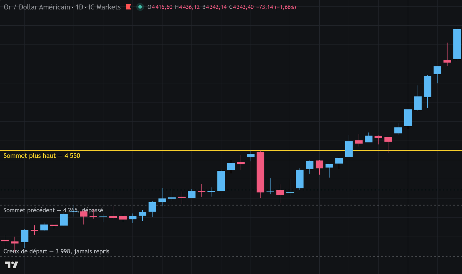
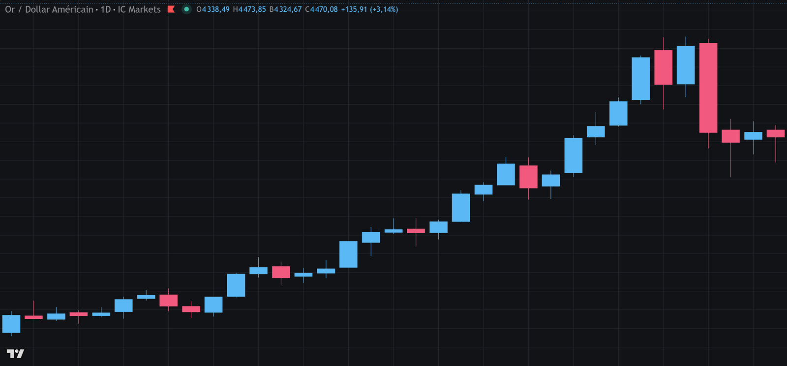
The structure, in a real case. Each low forms above the one before — 4,223 then 4,313 — and each high does too — 4,372 then 4,450. The line joins the lows: as long as it holds, the trend holds. This is not a visual impression but four prices you can check.XAU/USD, daily — chart by TradingView. Past data, with no predictive value.
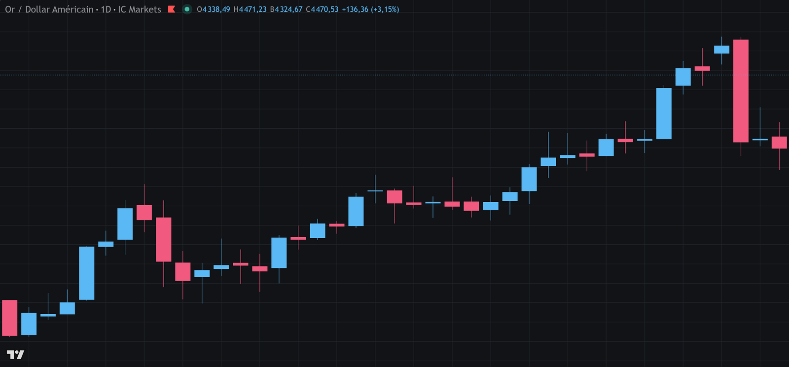
BOS Break of Structure: a high is taken out (or a low broken) in the direction of the current trend. The trend is confirmed by it. · CHoCH Change of Character: the first break in the opposite direction. It is the signal that the trend is changing. · Order Block the last candle in the opposite direction before the impulse leg. Price often comes back to it before moving on. · FVG Fair Value Gap: a price interval crossed so fast that no trading took place inside it.A trend is not an impression, it is a sequence you can check: three times, a high is taken out without a low being taken back — 4,265 in December, 4,550 in January, 5,119 in February. As long as that alternation holds, the trend holds. The day a low gives way before a high is taken out, it is over.Gold against the dollar, daily — chart by TradingView. Past data, with no predictive value.
Worked example
A pullback entry, from start to finish
Gold is in an uptrend on the daily timeframe. Price is pulling back toward the last higher low. Here is the full construction of the trade, from establishing the trend to the exit.
Inputs
Capital
€10,000
Risk accepted
1% → €100
Last higher low
4,180
Previous high
4,440
Pullback down to
4,205
Resumption signal at
4,230
Calculation
Trend confirmed: lows 4,020 then 4,180 (rising), highs 4,300 then 4,440 (rising)
Entry on the resumption signal: 4,230
Stop below the pullback low with a margin: 4,165 → risk 65 points
Target at the previous high: 4,440 → gain 210 points
Notice where the good ratio comes from: it was not chosen, it follows from having waited for the pullback. An entry at 4,400, at the top of the impulse leg, would have required the same stop at 4,165 — that is 235 points of risk for 40 points of potential gain. Patience does not just improve the entry price: it changes the whole economics of the trade.
Worth remembering
You enter on a pullback, never at the top of an impulse leg: that is what brings the stop closer and transforms the ratio.
Trend following gives a 35 to 45% win rate. Profitability comes from the size of the winners.
Exiting too early destroys this approach more surely than any bad entry.
Put it into practice
Spot ten pullbacks, without trading
1On your instrument, on the daily, go back six months.
2Identify ten established trends and, in each one, the first pullback toward the last higher low.
3For each case, work out the reward-to-risk ratio a pullback entry would have given, then the ratio an entry at the top of the impulse leg would have given.
4Compare the two sets. The gap will convince you better than any argument.
04 Trading ranges
Since the market spends most of its time without direction, you may as well know how to make use of it. Range trading is the only family designed for this regime — and it demands exactly the opposite qualities to trend following.
The principle: when price swings between two levels without breaking them, you buy near support and sell near resistance. You are betting on the swing continuing, not on it breaking.
The approach produces a high win rate — often 60 to 70% — because the most likely scenario really is that the range continues. Its gains, on the other hand, are mechanically limited by the width of the range.
A readable range: price runs into the same zones several times. Notice that the wicks push into the zones — which is why the stop goes beyond the zone, never on the line.
The conditions for a tradable range
At least two touches on each side. A single contact does not define a level.
Enough width. The trip from support to resistance has to cover at least three times your risk, costs included. Below that, it is not worth the trouble.
No trend on the higher timeframe. A range inside a strong trend stands a good chance of being broken in the direction of the trend.
No major release coming up. A central bank decision takes price out of its range in a matter of minutes.
The risk specific to this approach
Every range gives way in the end. That is even what it is for: ranges are periods when orders build up and lead to a move. So the range trader wins small amounts regularly and loses occasionally when the range breaks.
The arithmetic works provided the stop is respected. It collapses completely if you widen the stop telling yourself that "price will come back into the range" — because on that particular day, it will not.
The trap of the comfortable range. Range trading gives a very pleasant feeling of control: you win often, the moves are readable, the account grows steadily. That steadiness pushes you to increase size. But the loss arrives all at once, when the range breaks, and often with a violent move. Sizes have to be calibrated on that day, not on the twenty comfortable days before it.
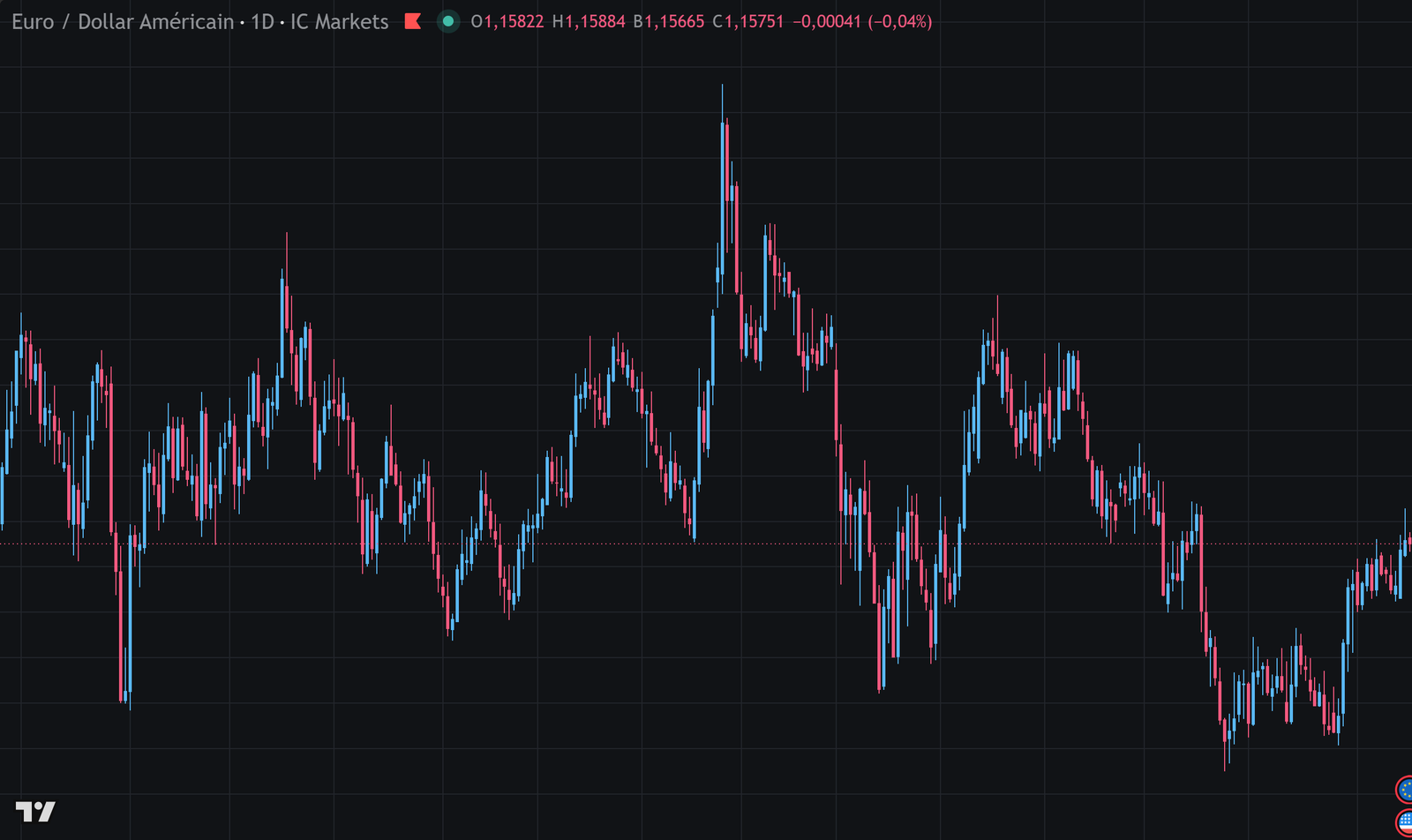
Range a market with no direction, held between two boundaries. It is the most common state of a market. · Range high / Range low the two boundaries. They are not declared in advance: they are observed after several round trips.Fourteen months between two boundaries 3.8% apart. Price visits one, then the other, without ever settling beyond them. A range is not declared in advance: it is observed after several round trips, and it stops existing the day one boundary gives way decisively.EUR/USD, daily — chart by TradingView. Past data, with no predictive value.
Worked example
The arithmetic of a range over a quarter
A trader works a range on EUR/USD for three months. He wins often and loses rarely. Here is whether that is enough — and on what condition.
Worse scenario: on the 3 range breakouts, the stop is widened
Average loss on those 3 trades: 2.5R instead of 1R
Correction: 3 × (−1.5R extra) = −4.5R
Corrected result: 10.2 − 4.5 = +5.7R, or +€570
Result+€1,020 respecting the stop · +€570 widening it three times
Three lapses out of sixty trades — 5% of the decisions — cost 44% of the quarter's performance. That is the usual ratio in this approach: range trading wins small and often, so it survives no loss outside the norm. Discipline on the stop is not a recommended quality here, it is what makes the method possible at all.
Worth remembering
A range needs at least two touches on each side and a width of at least three times the risk.
Every range gives way in the end: the method wins small and often, and loses on the breakout.
Widening the stop destroys the arithmetic. A few lapses are enough to wipe out a quarter.
Put it into practice
Measure before you trade
1Find a range in progress on your instrument and measure its width in points or pips.
2Work out the ratio between that width and the stop you would have to place beyond the zones. If it is below 3, leave that range alone.
3Note the number of touches on each side and the date the range formed.
4Follow it without trading until it breaks, and note how the break happened. You will learn more than by taking three positions in it.
05 Trading breakouts
When a range gives way, the move that follows is often clean and fast. That is what the breakout trader is after. It is also the approach that produces the most false signals — and knowing why those false signals exist changes everything.
The principle: you enter the moment price crosses a level that has contained it until then, betting that the break releases a directional move.
The underlying logic is sound. While a range lasts, orders build up on both sides: sellers' stops above the resistance, buyers' stops below the support. When the level gives way, those stops trigger one after another and feed the move.
Why there are so many false breakouts
That build-up of orders is exactly what creates the problem. A zone where stops are known to sit is a target: pushing price through it releases liquidity. So price frequently crosses a level briefly, triggers the stops, then comes straight back into the range.
There is nothing mysterious about this and it involves no hidden manipulation: it follows mechanically from the fact that many participants place their orders in the same obvious places.
Signs of a solid breakout
A clean close beyond the level, not just a wick
Volume clearly above average
Price does not come straight back into the range
The breakout goes with the higher timeframe trend
Signs of a false breakout
A long wick beyond the level, body inside
Ordinary or low volume
A return into the range within one or two candles
A breakout against the higher timeframe trend
The two ways to enter
The immediate entry, as soon as the level is crossed, catches every real move but takes every false one. It suits you if your stop is tight and your target ambitious.
The retest entry waits for price to come back and touch the broken level from the other side before entering. It removes a large share of false breakouts and gives a better price — at the cost of missing the moves that never come back to test.
Neither is better in absolute terms: they trade win rate against number of opportunities. The only way to settle it is to measure both on your own data.
The retest changes the nature of the trade. On an immediate entry, your stop goes on the other side of the range: it is wide. On a retest entry, it goes just below the retested level: it is tight. For the same target, the reward-to-risk ratio of the retest is structurally far better. That is often what decides, more than the win rate.
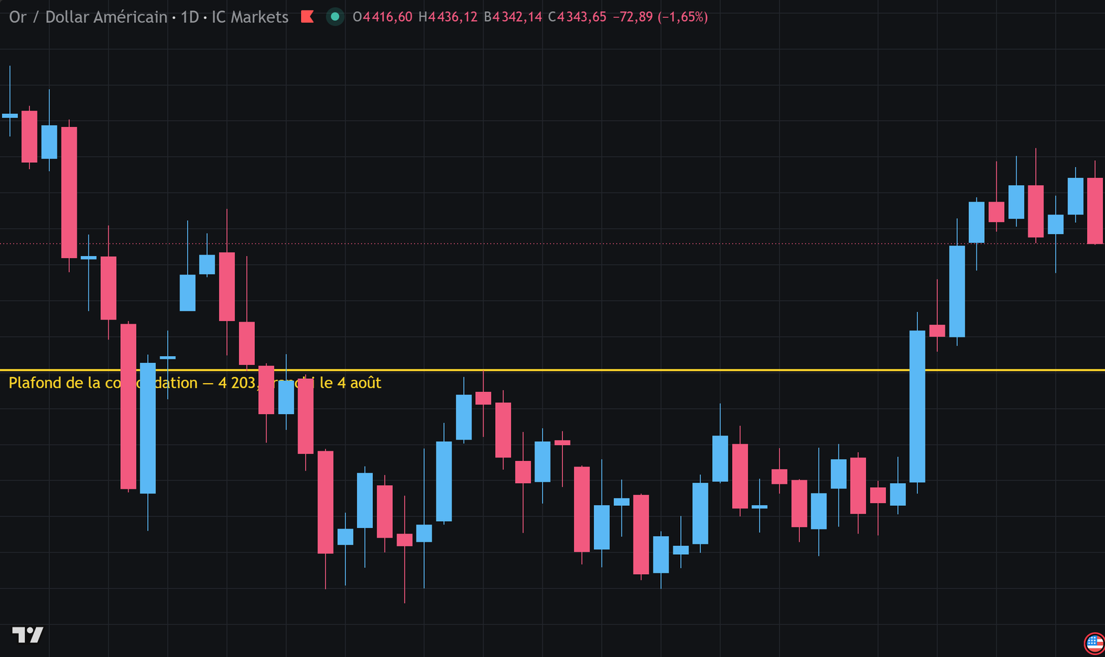
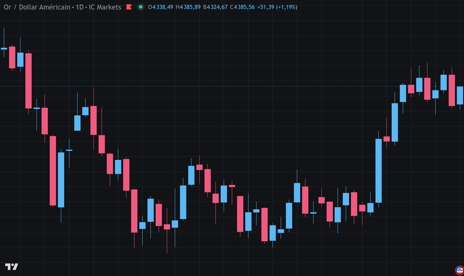
Two months of back and forth below 4,203, then a session that closes well above it, on 4 August. This is the shape you are looking for: a long compression, then a clean break — not a move a handful of points beyond the level followed by a return.Gold against the dollar, daily — chart by TradingView. Past data, with no predictive value.
BOS Break of Structure: a high is taken out (or a low broken) in the direction of the current trend. The trend is confirmed by it. · CHoCH Change of Character: the first break in the opposite direction. It is the signal that the trend is changing. · Order Block the last candle in the opposite direction before the impulse leg. Price often comes back to it before moving on. · FVG Fair Value Gap: a price interval crossed so fast that no trading took place inside it.Two bearish breaks extend the trend, at 4,367 then 4,024. The third is of another kind: on 4 August it is a high that gives way, at 4,166. The imbalance left by that move has never been filled — a sign that the move was carried, not improvised.Gold against the dollar, daily — chart by TradingView. Past data, with no predictive value.
Worked example
Immediate entry or retest: two years of data
A trader compares the two approaches on the same hundred breakout signals, replaying them on their historical data. The stop and the target necessarily differ, since the entry point changes.
Inputs
Signals studied
100
Immediate — entry
at the breakout close
Immediate — stop
other side of the range (2R wide)
Retest — entry
on the return to the level
Retest — stop
below the level (0.8R wide)
Shared target
projection of the range
Calculation
Immediate — 100 signals taken, 38 winners at +1.5R, 62 losers at −1R
Immediate: (38 × 1.5) − 62 = 57 − 62 = −5R
Retest — only 54 signals come back to test the level
Retest — 32 winners out of 54, or 59%, at +3.2R (tighter stop)
Retest: (32 × 3.2) − 22 = 102.4 − 22 = +80.4R
Opportunities missed by the retest: 46 signals not taken
ResultImmediate: −5R · Retest: +80.4R for half as many opportunities
The retest wins by a wide margin, and not thanks to the win rate — even though that improves too. It wins because the tighter stop doubles the reward-to-risk ratio. It is the clearest demonstration in the module: on one and the same market idea, it is the entry point that determines the economics of the trade, far more than the accuracy of the analysis.
Worth remembering
False breakouts exist because stops build up at the obvious levels. It is mechanical, not hidden.
A solid breakout closes beyond the level on volume and does not come straight back.
The retest entry gives fewer opportunities but a far tighter stop — often the deciding factor.
Put it into practice
Compare the two entries on your data
1Find twenty past breakouts on your instrument, on the daily.
2For each one, note whether price came back to test the level, and how many candles it took.
3Work out the reward-to-risk ratio of both approaches over those twenty cases.
4Choose the one that wins on your data, and write it into your plan. Do not use both: you would no longer be able to measure which one works.
06 Reading raw price
Reading price without indicators — price action — means interpreting directly what the candles and the structure are saying. It is the most universal approach, and the most subjective. Three setups are enough to start.
The founding idea is simple: an indicator only restates price, with a delay. You may as well read the source. Price action seeks to identify, in the shape of the candles and the way they follow one another, whether buyers or sellers have taken the upper hand.
The rejection candle
A candle with a small body and a long wick on one side only tells you an attempt was pushed back. A long lower wick shows that sellers drove price down, then that buyers took control again before the close. It is the reversal signal that is easiest to read.
Its value depends entirely on where it appears. At a major support being tested for the third time, it means something. In the middle of nowhere, it says nothing at all.
The engulfing candle
A candle whose body completely covers the previous one, in the opposite direction, signals a reversal in the balance of power over that period. A bullish engulfing candle after a run of bearish candles shows that buyers not only absorbed the selling pressure, but went beyond it.
Like the previous one, it is worth nothing without its context — and without its size relative to the surrounding candles.
The indecision candle
A tiny body with wicks on both sides shows that neither side gained the upper hand. On its own, it says nothing. After a clean move, it signals a loss of steam that deserves attention.
It is particularly useful as a signal to stand aside: seeing a run of indecision candles is a good reason not to take a position.
The honest limit of price action. This approach is hard to measure, precisely because it is a matter of interpretation. Two traders looking at the same chart will not identify the same setups, and the same trader will not identify the same ones six months apart. That subjectivity makes backtesting unreliable and leaves room to tell yourself stories after the fact. If you use this approach, write down criteria that are as objective as you can make them: wick length relative to the body, size relative to the previous ten candles.
Worth remembering
Three setups are enough: rejection, engulfing, indecision.
None of them is worth anything on its own. It is the level where it appears that gives it its meaning.
The approach is subjective, so it is hard to measure. Write down numerical criteria to make up for that.
Put it into practice
Make your criteria objective
1Write down what a rejection candle is for you: for example, a wick more than twice the body, and the body in the top third of the candle.
2Apply that criterion to a hundred past candles and count how many meet it. If more than twenty do, your criterion is too loose.
3For each one, look at what price did over the following three candles.
4Adjust the criterion until it selects rarely, and well.
07 Working with levels
Support and resistance are not a strategy on their own, but they are the frame that almost every other one rests on. This chapter goes deeper into what the Basics module introduced.
A level draws its strength from the number of participants who have it in mind. That is why levels visible on the higher timeframes carry more weight: more people are watching them, including institutional players whose orders genuinely move price.
The hierarchy of levels
Type of level
How it forms
Relative weight
All-time high / low
extreme never exceeded
very high
Yearly high / low
extreme of the current year
high
Weekly high / low
extreme of the past week
medium to high
Previous daily close
reference for many algorithms
medium
Round numbers
psychological cluster of orders
variable, often underestimated
Intraday level
formed during the session
low, good for a few hours
The polarity flip
When a resistance gives way, it frequently becomes a support, and the other way round. There is nothing magical about the switch: those who were selling at that level are now losing, and many will look to get out at break-even if price comes back, while those who missed the breakout are watching for a second entry.
It is one of the most workable setups for a beginner, because it offers a precise entry point, an obvious stop just on the other side of the level, and a readable target.
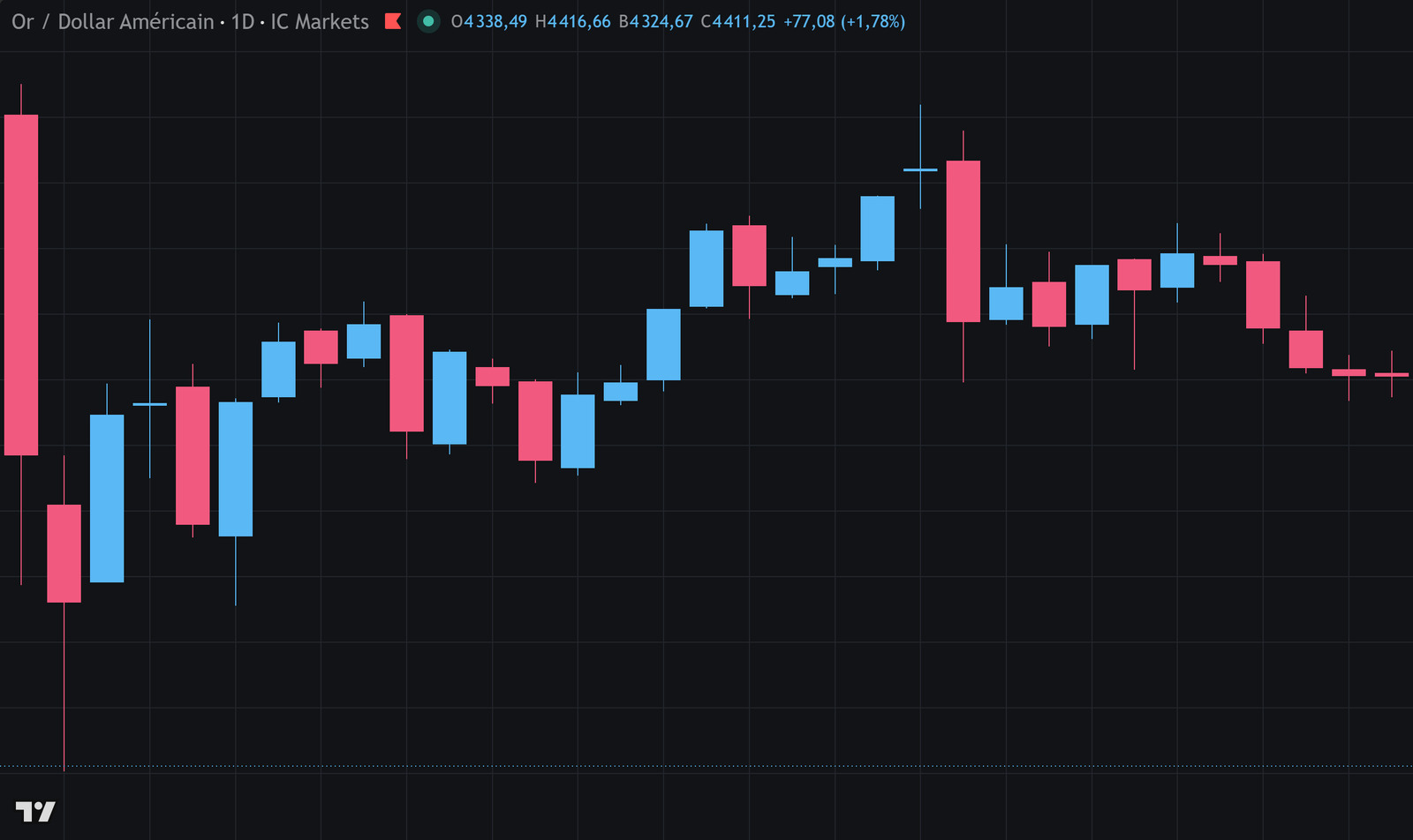
The same price, two roles one after the other. Three times the level pushes the advance back; on 10 December it gives way; twice after that it holds up the decline. Nothing has changed on the chart — it is the positions of the participants that have switched sides.Gold against the dollar, daily — chart by TradingView. Past data, with no predictive value.Zones hold as long as they do not give way — then they change roles. It is one of the market's most regular behaviors, and one of the easiest to build into a plan.
The three-to-five levels rule. A chart carrying more than five levels no longer gives you information: it confirms whatever idea you already have. If you hesitate about keeping a line, delete it. The goal is not to map the market, but to identify the two or three places where something has a chance of happening.
Worth remembering
A level's strength comes from the number of participants watching it: the higher timeframes come first.
A broken level changes role. The retest from the other side is one of the most workable setups.
Three to five levels per chart. Beyond that, what you draw confirms your ideas instead of informing you.
Put it into practice
Build your map of levels
1On your instrument, note the high and the low of the year, along with those of the current month.
2Add yesterday's daily close and the two round numbers nearest the current price.
3That gives you five or six markers — that is enough. Update them every week, not every day.
4For two weeks, note which ones actually produced a reaction. You will then know which ones matter for your instrument.
08 Confluence
Making several independent reasons coincide in the same place clearly improves the quality of your entries. It is the most profitable principle in the module — and the one that, taken too far, produces paralysis.
The idea: rather than entering on a single criterion, you wait for several independent elements to point to the same level. An uptrend, a major support, a rejection candle and a retracement to an expected level make up a confluence of four factors.
The reasoning is probabilistic. If each factor brings a slight edge and the factors really are independent, putting them together noticeably improves the probability. The important word is independent.
False confluence. Stacking three indicators that all compute an average of price creates no confluence at all: they will always say the same thing, since they measure the same thing. This is the most widespread mistake. Real confluence combines sources of a different nature — a trend structure, a historical level, the behavior of a candle, a session context.
How many factors
Two factors are not enough to filter seriously. Three are the right compromise. Beyond four, the setups become so rare that you stop trading — and a trader who does not trade learns nothing.
There is also a perverse effect: the more factors you demand, the more tempted you will be to interpret some of them loosely to reach the count. Three strict criteria are worth more than five negotiable ones.
Worked example
What confluence actually changes
A trader has three filters, each measured separately in their journal. Here is the effect of combining them over a year — and the cost of that selectivity.
Here is the counter-intuitive result of this module. Each extra filter does improve the quality of each trade — expectancy goes from 0.14 to 0.68R. But it cuts the number of opportunities so much that the total result falls. The optimum here sits at one or two filters, not three. Confluence is not a virtue in itself: it is a trade-off between quality and frequency, and that trade-off can be measured. Do not stack filters on principle.
Worth remembering
Real confluence combines sources of a different nature. Three averaging indicators do not make one.
Every filter improves the quality of each trade but reduces the number of opportunities.
The optimum is something you measure: it is not always the largest number of filters.
Put it into practice
Measure your filters one by one
1List the criteria you already use, even the implicit ones.
2From your journal, calculate the win rate with and without each one, taken on its own.
3Keep the two that add the most, and drop the rest.
4Recalculate your total result, not just your expectancy per trade. It is the total that pays.
09 Fibonacci retracements
A tool you see everywhere, often presented with a mystical aura it does not deserve. Let us look at what it actually does, why it sometimes works, and where the evidence honestly stops.
The tool is placed between a low and a high, and draws intermediate levels at 23.6%, 38.2%, 50%, 61.8% and 78.6% of the move. The common use is to look for the trend to resume at one of these retracements.
These proportions come from the Fibonacci sequence, a mathematical series found in certain natural structures. The 50%, which is usually included, is not part of it at all: it is simply the halfway point.
What is proven, and what is not
No serious study establishes that markets obey the Fibonacci sequence. The research that has looked into it finds no statistical edge attributable to the ratios themselves.
A simpler explanation, on the other hand, does hold up: these levels are watched by a great many people. Tens of thousands of traders and plenty of algorithms draw the same retracements on the same moves and place orders there. So the level works because it is being watched — it is a self-fulfilling prophecy, which takes nothing away from its practical usefulness but changes a great deal about what you can expect from it.
What this means in practice. If the effect comes from collective attention, then only the obvious retracements count: those drawn on moves everyone can see, on timeframes everyone watches. A retracement placed on an obscure five-minute move has no reason to work, since nobody else is drawing it.
Sensible use
Fibonacci works well as a confluence tool and badly as a signal on its own. A 61.8% retracement that lines up with a historical support and a rejection candle makes an interesting setup. The same retracement on its own, in the middle of nowhere, is worth no more than a line drawn at random.
The zone between 38.2% and 61.8% is the one that draws the most attention. A retracement beyond 78.6% generally calls the structure itself into question: at that stage it is no longer a pullback within a trend, it is probably a reversal.
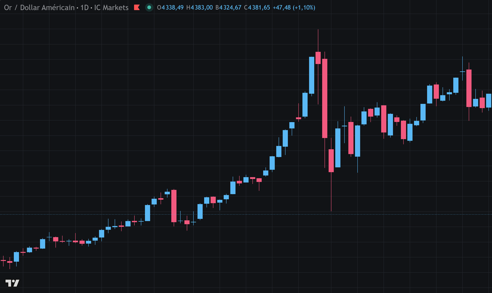
38.2% · 50% · 61.8% the three most widely watched retracements. They are not predictions but zones where a lot of participants are looking at the same time.The impulse leg runs from 4,403 on 1 February to 5,119 on the 10th. The pullback stops at 4,843 — three points below the 38.2% level — then the move resumes and takes out its own high. The level held; it does not always hold, and that is why you place an order there, never a certainty.Gold against the dollar, daily — chart by TradingView. Past data, with no predictive value.
Worked example
A retracement, worked through from end to end
Gold rises from 4,020 to 4,440, then corrects. Here are the retracement levels and how to use them without crediting them with more power than they have.
Inputs
Low of the move
4,020
High of the move
4,440
Size of the move
420 points
Known historical support
4,175
Timeframe
daily
Calculation
23.6% retracement: 4,440 − (420 × 0.236) = 4,341
38.2% retracement: 4,440 − (420 × 0.382) = 4,280
50.0% retracement: 4,440 − (420 × 0.500) = 4,230
61.8% retracement: 4,440 − (420 × 0.618) = 4,180
78.6% retracement: 4,440 − (420 × 0.786) = 4,110
The 61.8% (4,180) lines up with the historical support (4,175)
Gap between the two: 5 points, or 1.2% of the move
ResultOne zone of interest only: 4,175 — 4,180
Five levels drawn, one that counts. It counts not because it sits at 61.8%, but because that retracement falls on a support already identified independently. Without that coincidence, none of the five levels would justify a position. That is exactly how the tool should be used: as a way of revealing coincidences, never as a source of truth.
Worth remembering
No study establishes that markets follow Fibonacci. The observed effect comes from collective attention.
Only the obvious retracements count, drawn on moves that everyone is watching.
The tool is worth something in confluence, not on its own. Beyond 78.6%, you are no longer in a pullback.
Put it into practice
Test the coincidence, not the ratio
1Take twenty clean past moves on your instrument, on the daily.
2Draw the retracements and note, for each one, whether a level lines up with a support or resistance you had already identified.
3Compare how price reacts in the cases where they line up and in the others.
4You will probably conclude that the ratio on its own adds nothing — and you will have checked it yourself rather than taking my word for it.
10 The Smart Money Concept
A family of approaches that has become very widespread in recent years, offering to read the market through the presumed behavior of large players. It brings genuinely useful reading tools — and comes with a narrative you need to be able to separate from the method.
The premise: market moves are not random but orchestrated by players with considerable resources, who first have to build up liquidity before they can commit large volumes. So they go looking for the areas where retail orders pile up — below the obvious lows, above the obvious highs — before setting off in the direction they want.
There are two things to separate in this approach: a sound market observation, and an explanation that goes well beyond what can be demonstrated.
What holds up
The central observation is correct and easy to check: price very often reaches for the areas where stops are concentrated before turning back the other way. You have already met this in the chapter on breakouts.
There is nothing conspiratorial about the mechanism. A large order can only be filled where there is someone on the other side. Stop zones are precisely reservoirs of counterparty. That a large player finds it worth going there is market mechanics, not a plot.
Liquidity zones — below the obvious lows, above the obvious highs. A useful concept, and verifiable.
The break of structure — the moment the sequence of lows and highs reverses. It is a rigorous way of reading the trend, already covered in chapter 2.
The imbalance — a price gap left by a move that was too fast, which price often comes back to fill. Observable and measurable.
The order block — the last opposite candle before a clean move. It is a definition of a zone of interest, not proof of institutional intent.
What holds up less well
The overall story — "smart money" deliberately hunting retail stops — cannot be demonstrated, and it is not needed for the method to work. The concepts stand perfectly well without that narrative.
That narrative also has two harmful effects. It provides an explanation for every loss: if the trade fails, you were "hunted", which spares you from examining your own method. And it makes the approach impossible to falsify, and therefore impossible to improve.
The real risk with this family of approaches. Its concepts are matters of interpretation. On the same chart, ten practitioners will identify ten different zones, and each will find, after the fact, a reading that explains the move. That flexibility makes measurement very hard — and without measurement, no progress. If you use this approach, the absolute priority is to write criteria precise enough that someone else can check whether you followed them.
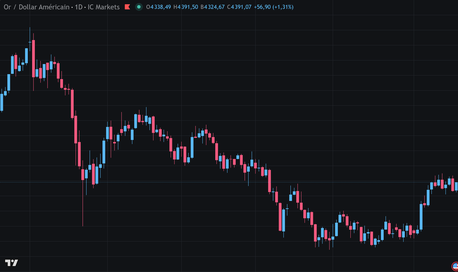
BOS Break of Structure: a high is taken out (or a low broken) in the direction of the current trend. The trend is confirmed by it. · CHoCH Change of Character: the first break in the opposite direction. It is the signal that the trend is changing. · Order Block the last candle in the opposite direction before the impulse leg. Price often comes back to it before moving on. · FVG Fair Value Gap: a price interval crossed so fast that no trading took place inside it.Six months of price data, read like a map. On 17 March, price breaks a low instead of a high: the trend changes character. Four breaks then confirm it, from 4,644 down to 4,024. On 4 August the mechanism reverses — a high is broken, and the structure turns bullish again. Nothing here is predictive: everything is established after the fact, and that is precisely what makes the reading verifiable.Gold against the dollar, daily — chart by TradingView. Past data, with no predictive value.
FVG Fair Value Gap: a price interval crossed so fast that no trading took place in it. You spot it across three candles, when the high of the first stays below the low of the third.On 21 September the rise is so clean that a whole interval is never traded: between 3,685 and 3,737, not a single transaction. Two sessions later price comes back and places a wick in the zone, without ever filling it — then moves 645 points higher. A zone cut straight through would have taught nothing; this one held.Gold against the dollar, daily — chart by TradingView. Past data, with no predictive value.
Worth remembering
The central observation is sound: price reaches for liquidity before it goes. That can be verified.
The story of "smart money" hunting retail traders is neither demonstrable nor necessary.
The danger of the approach is how freely it can be interpreted: it explains everything after the fact, so it never improves.
Put it into practice
Make your criteria verifiable
1If you use this approach, write down the exact definition of a zone: on which timeframe, how many candles, what minimum size.
2Apply it to thirty past cases and count how many zones you identify. If the number changes with your mood, the criterion is too loose.
3For each trade, note whether the zone had been identified before the move or recognized afterwards. Only the first kind counts.
4Measure the expectancy on those trades identified in advance. It is the only honest measure of the method.
11 Testing a strategy
An untested method is only an opinion. Testing turns the opinion into data — provided it is done honestly, which is harder than it looks, because the main obstacle is not a technical one.
Testing means replaying your method on past data and measuring what it would have produced. The aim is not to reassure yourself: it is to get a reliable expectancy and a reliable drawdown, so you know what to expect before you commit money.
The method, step by step
1Write the rules before you start. Any rule added during the test invalidates the test.
2Choose a period of at least a year, covering varied market regimes — a period that only goes up proves nothing.
3Move forward candle by candle, without seeing what comes next. This is the critical point, and platforms offer a mode that hides the future.
4Record every trade: entry, stop, target, result in R, and market regime.
5Aim for at least a hundred trades. Below that, variance dominates and the result means nothing.
6Calculate the expectancy, the maximum drawdown and the longest losing streak.
The four traps
Seeing the future. Scrolling through a chart while knowing what happened invariably produces excellent results. It is the number-one trap, and it is often unconscious.
Curve fitting. Changing the rules until the past result looks good gives you a method perfectly suited to the year just gone and worthless for the next one.
Forgetting costs. Spread, commissions and slippage regularly turn a marginally profitable method into a losing one. They have to be in the test.
Too short a sample. Thirty trades measure nothing. Variance produces flattering or catastrophic runs that have nothing to do with real quality.
The held-out sample rule. Test on one period, then validate on another you have never looked at. If the results collapse on the second, your method was fitted to the data of the first. It is the only real protection against curve fitting, and it is surprisingly little used.
Worked example
Reading a test result honestly
A trader presents the result of his backtest. The numbers look excellent. Here is what to check before believing them.
Correction 1 — costs: about 0.08R per trade on this instrument
Corrected expectancy: 0.71 − 0.08 = +0.63R
Correction 2 — sample: 46 trades, margin of error on the win rate ≈ ±14 points
So the real rate lies somewhere between 47% and 75%
At 47%: (0.47 × 1.8) − 0.53 = +0.32R
At 75%: (0.75 × 1.8) − 0.25 = +1.10R
ResultLikely real expectancy: between +0.32 and +1.10R — not +0.71
The test is not bad: even on the low assumption, expectancy stays positive, which is encouraging. But the interval is enormous, and that is the thing to remember. With 46 trades you do not know your expectancy: you know a wide range. It takes around three hundred trades to narrow that interval to a few points. This is why you never draw conclusions after a few dozen trades, in testing or live.
Worth remembering
An untested method is an opinion. Testing turns it into data, as long as you do not cheat.
The main trap is seeing the future, often without realizing it.
A sample of fewer than a hundred trades gives you not an expectancy but a very wide range.
Put it into practice
Run a clean test
1Write out your rules in full, before anything else. Date the document.
2Choose two separate periods: one to test on, one you will not look at until the end.
3Replay a hundred trades on the first, candle by candle, in hidden mode, costs included.
4Then validate on the second. If the results collapse, the method was fitted — start again without changing it along the way.
12 Choosing yours
This last chapter will not tell you which strategy to adopt — nobody can do that for you. It gives you the method for deciding, and the criteria that really matter.
The criterion that decides everything: your availability
It is not your preference, or your risk tolerance, or your taste for one approach over another. It is the time you genuinely have, on a regular basis. A method that does not fit your schedule will be applied badly, whatever its intrinsic quality.
Style
Time required
Trades
Weight of costs
Difficulty
Scalping
4 hours a day, focused
10 to 30 a day
crushing
very high
Day trading
2 to 4 hours a day
2 to 5 a day
high
high
Swing trading
30 minutes a day
3 to 10 a month
low
moderate
Position trading
2 hours a week
1 to 5 a quarter
negligible
moderate
The weight of costs follows directly from frequency. It is one of the reasons scalping is far harder than it looks: you have to beat the costs before you earn anything at all.
The recommendation for a beginner. Swing trading, without hesitation. Decisions are rare and therefore considered, costs weigh little, the daily timeframe filters out the noise, and half an hour a day is enough. Almost nobody starts there — and that is one of the reasons almost nobody succeeds.
How to decide
1Work out the time you really have, in hours per week, honestly.
2Rule out the styles that do not fit. One or two will usually be left.
3Choose a single family of strategy within that style. One only.
4Write it out using the five questions from chapter 1.
5Test it over a hundred trades before committing any real money.
6Change nothing for three months. Most methods are abandoned before they have been measured.
The collector's trap
The most common mistake at this stage is to pile up approaches: a bit of trend, a bit of range, a bit of price action, depending on what the market seems to be doing. It looks adaptive; in reality it guarantees that you will never measure anything.
A mediocre method applied consistently and measured over three hundred trades will teach you infinitely more than six excellent methods applied at random. The goal of the first months is not to make money: it is to get data you can improve on.
Worth remembering
The time you really have determines your style, before any other consideration.
Swing trading is the most sensible starting point: rare decisions, low costs, noise filtered out.
One method only, measured over at least a hundred trades. Collecting approaches makes any measurement impossible.
Put it into practice
Write your strategy, on one page
1Take the five questions from chapter 1 and answer them for the method you have chosen.
2Check each answer with the third-party test: could someone else judge whether you followed it?
3Test over a hundred trades in hidden mode, costs included, before committing any real money.
4Then move on to the Safety module: it deals with what destroys sound methods, and you will need it.